"Your only as good as your last project."
Home
Portfolio
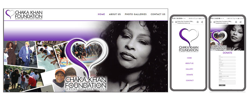
Chaka Khan
Publishing
Logo Designs
Entertainment
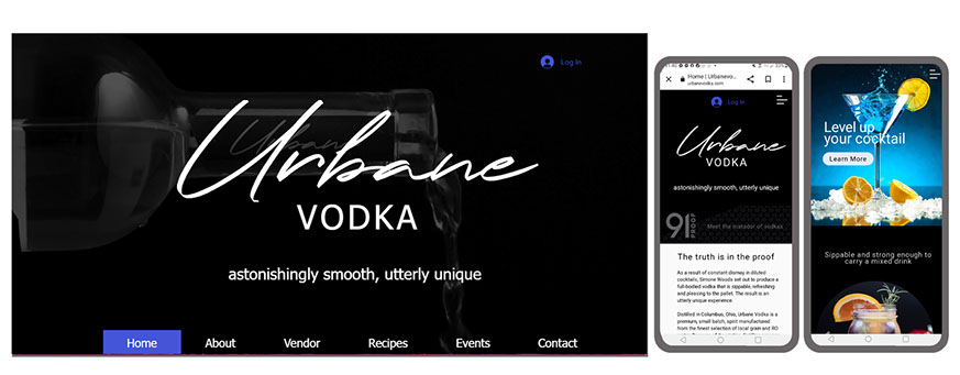
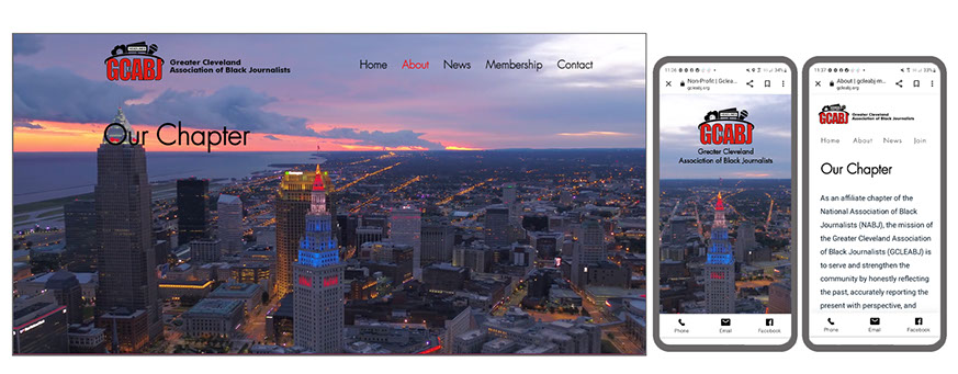
UX Designs
Annual Reports
Cosmetics
Non-Profit
Los Angeles Times
Events
Festival of Health
Travel Show
KidsCity
Contact Me
Wayne Henry Design
Next
©2022 Wayne Henry Design